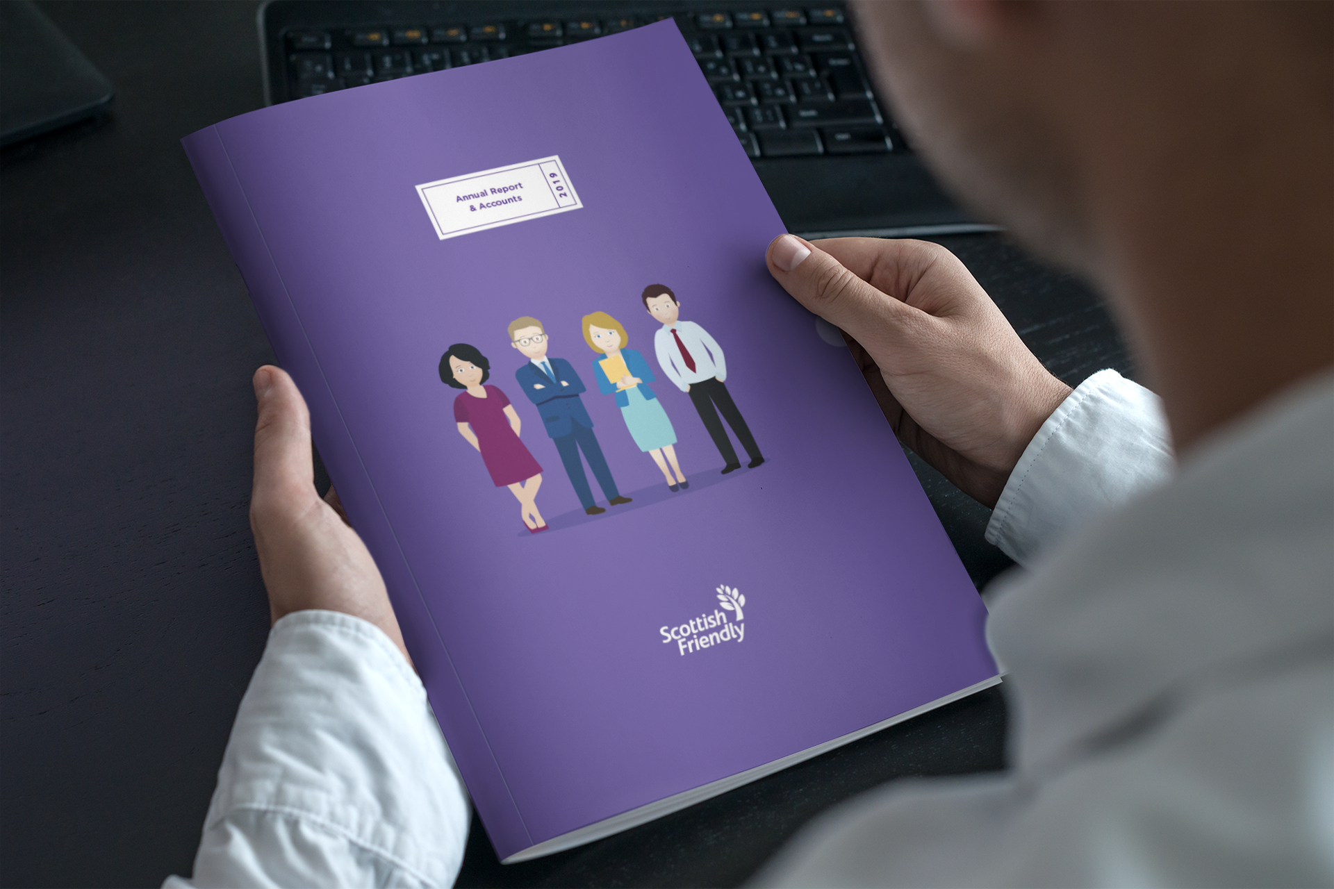
The in-house marketing team at Scottish Friendly requested I redesign the Annual Report & Accounts publication to bring it in line with the new brand I had developed initially. The brief was to transform a notoriously mundane and complicated document into one that was accessible, user friendly and visually more stimulating to both people interested in core performance figures and those looking for a casual read.
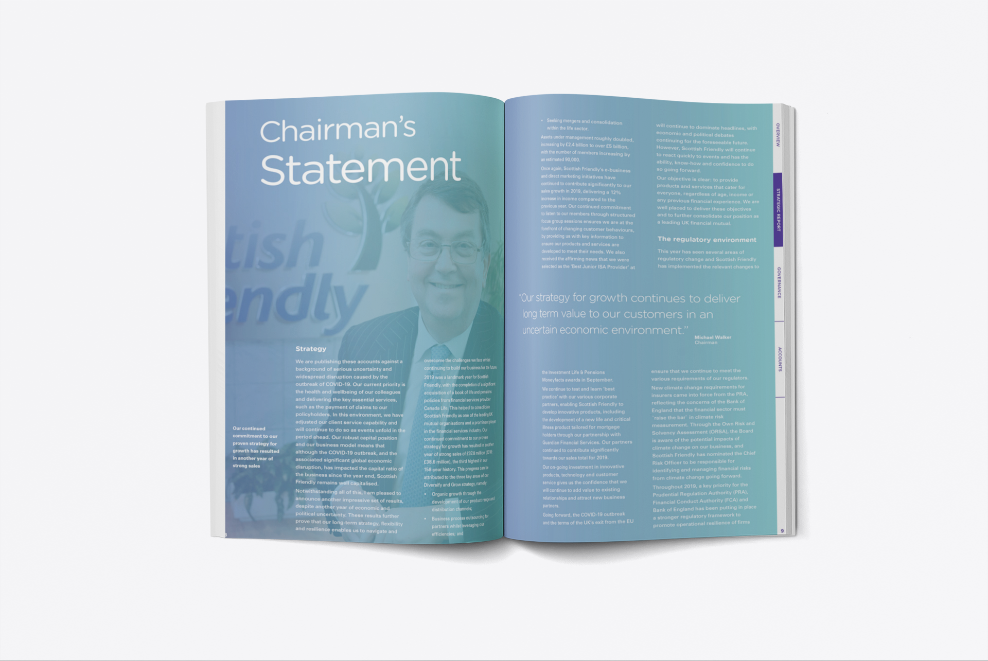
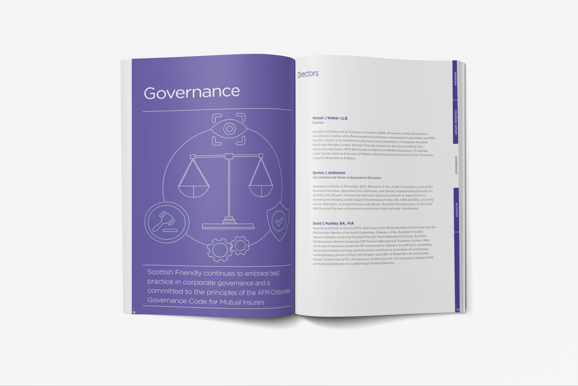
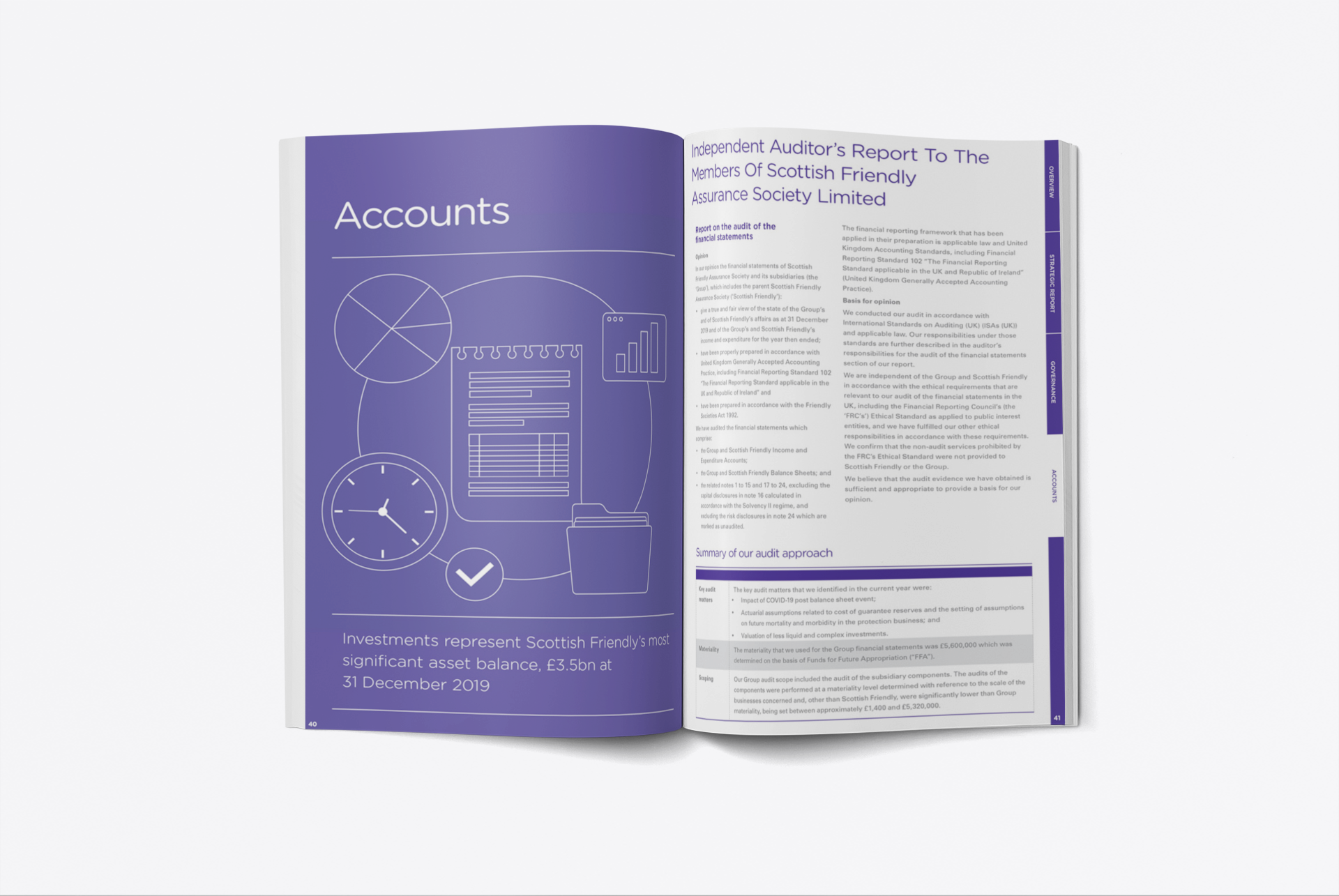
I introduced a navigation system at the edge of the pages to aid locating the different sections through the document more easily. Accessibility was strengthened by redesigning the section pages themselves to stand out and be more prominent than content pages.
The layout itself employs good use of white space and strong contrast between headlines, subheads and pull-quotes to create a clear visual hierarchy throughout, with more imagery being introduced to break up text and aid casual browsing, making a text heavy document more easy on the eye.
Tables, being such an essential tool and feature, were also redesigned to be more organised, accessible and readable.
Here are a few page samples...